Summer School Creative Brief 1

Hey there!

I've been working on these three briefs over the past week or so, and I'm going to be submitting my final patterns today. I actually enjoy working to a brief, and I tend to create my own "briefs" when I'm creating patterns on my own. I like having guidelines, going with a certain theme, and creating a moodboard to help me start brainstorming ideas for patterns.

Soooo...here are my sketches, patterns, and some mockups from the three design briefs. I'm going to be choosing my favorite patterns to enter in the summer school classroom

Beginner's Brief #1: French Riviera

I ended up using a lot of the motifs I had already created for past nautical designs, and I'm pretty happy with the results. I think this would have been easier if I would have just created a design-not a repeating pattern, but I still think these capture the French Riviera tone. 


Intermediate Brief #1: Meadowland

ABSPD-Meadow.png

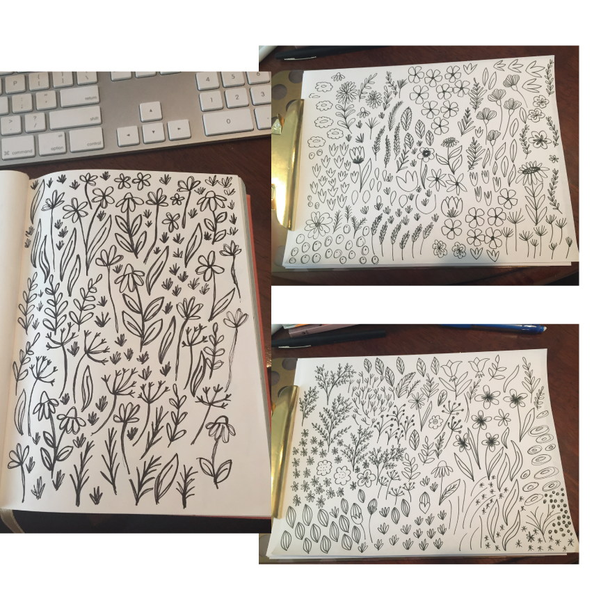
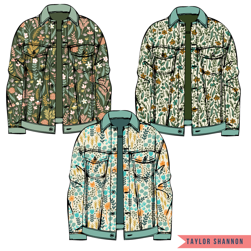
This was definitely my easiest brief to work with. I'm always doodling flowers, and I love how all of these dense, "meadowy" patterns turned out. I tried to work with color palettes that were different than my typical bright and crazy colors, and I think I captured the tone of nature and wildflowers.

Advanced Brief #1: Modern Pop Art

This was definitely the most difficult brief to work with. I don't have much (if any) experience with pop art design, but once I got my initial idea down, I got really excited about this brief! I actually love my final pattern. I think it's fun, has that "comic book" feel, and sticks to the brief well. 

The first week of briefs was a lot of fun! I'm excited to see what next week brings. It's going to be hard for me to decide which patterns to submit, but I'm glad that I'm satisfied with all of my patterns that I've created. Thanks for reading!
Make It In Design Summer School-Moodboards

Hey, y'all! 

It's a busy week for me as I begin to tackle the creative briefs for Make it in Design Summer School

I'm taking all three tracks-beginner, intermediate and advanced-so I have THREE projects that I'm currently working on. These are all due next Thursday, so I need to get going on my pattern ideas. I finished my moodboards for all three this morning, and I thought I'd share my whole process here! The three themes are French Riviera, Meadowland, and Pop Art. Below are my moodboards, and I'll be sure to post some in-progress sketches as I go! 

French Riviera Moodboard
Meadowland Moodboard
Pop Art Moodboard

Color Themed Collections 3

Whoa...third day in a row posting on here! I've been hard at work this week creating these color-themed collections. I'm planning on creating more color-themed collections in the future since they give me SO much inspirations for patterns!

Soooo..here is my black and white color moodboard:

Let's be real...I just wanted a reason to break out my paintbrushes and make a mess. I love these abstract patterns and their messiness. I also love how the black and white is so bold, yet classic. This color combination will never go out of style!

So here are my patterns and mockups using only black and white:

Color Themed Collections 2

Hola! Here is my second collection inspired by colors.

I created a color board around pastels for this collection:

I love how feminine this board ended up being. I wanted to incorporate tea, sweets, bows, and florals (duh) to this collection. 

The colors ended up being a little (okay...a lot) brighter than my moodboard. However, I think I stuck with the overall girly, tea-party theme. I think these patterns would be adorable on little girls' clothing, home decor, and toys. Here are my patterns and mockups: 

Color Themed Collections

Hey, y'all!

I wasn't sure what my next project should be centered around, so I decided to build some color-themed moodboards, then create pattern collections based off of the themes. I'm still tweaking a few things here and there, but I really like how these collections are turning out! I'm going to show my first collection today.

My first color-themed moodboard was "Boho Brights":

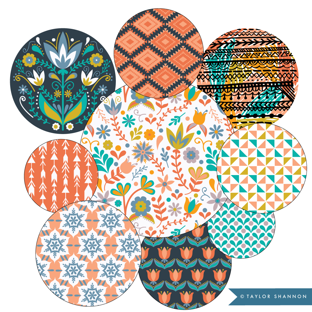
I loved the bright, earthy tones and the bohemian, organic shapes on this board. It gave off kind-of a folky, Mexican floral vibe, and I really enjoyed incorporating these themes into my motifs.

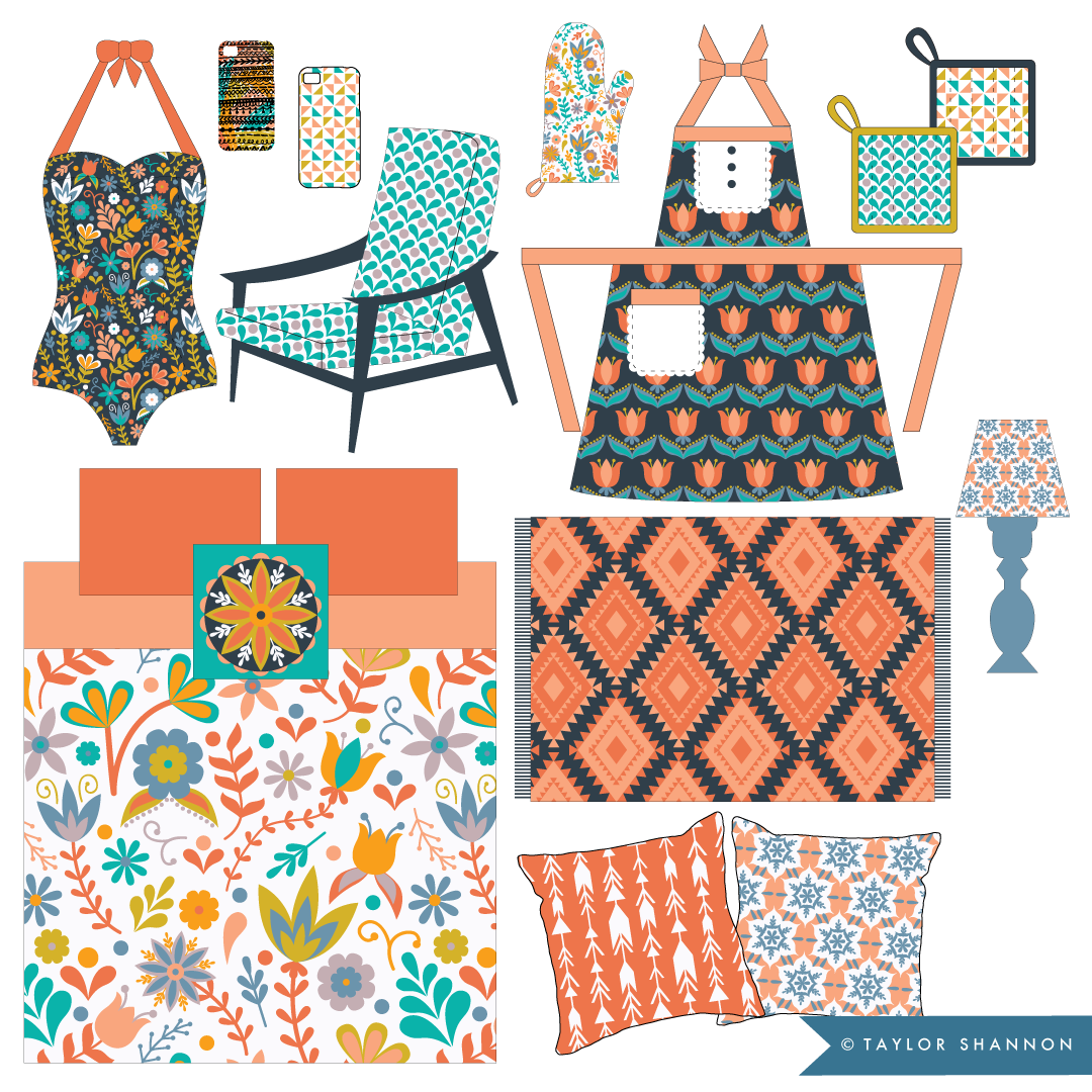
Below are my Boho Brights collection and mockups. I'm not even kidding when I say that I really want all of the products that I've mocked up with this collection! I toned down a lot of the extremely bright colors and decided to go with a more "neutral" (but still fun and bright!) color palette. I think the range of blues, oranges, and the pop of the mustard-gold color really work together well.

I'll be posting some of my other collections inspired by my color themes in the future!

Blog signature.png